> For the complete documentation index, see [llms.txt](https://docs.inverse.watch/llms.txt). Markdown versions of documentation pages are available by appending `.md` to page URLs; this page is available as [Markdown](https://docs.inverse.watch/user-guide/visualizations/chart-visualizations.md).
# Chart Visualizations
The application bundles together charts that use X & Y axes into the **Chart** visualization type, which can take eight different forms. Because the forms are similar, you can often switch seamlessly between them to find the one that best conveys your meaning. In the animation below, all eight charts were built from the same SQL query result:
chart visualization type
The charts in the above animation were all produced from the following tabular result:
### 1. Setup
Once you have run your query, you will receive your table. You can adjust the table's visualization as needed.
table visualization settings
Then, you can add a visualization and modify the settings. Your query should return at least two columns: one column of values for the **X axis** and one column of values for the **Y Axis**. It can also return values for trace [grouping](https://redash.io/help/user-guide/visualizations/chart-visualizations#Grouping), displaying [error bars,](https://redash.io/help/user-guide/visualizations/chart-visualizations#Error-Bars) and bubble sizes.
Once your query returns the right columns, start by setting your X and Y axis values. The visualization preview updates instantly. You don’t need to save the visualization to see how a change affects its appearance. Tabs on the Visualization Settings screen give you fine-grained control over the rest of chart.
Use the **X Axis** and **Y Axis** tabs to modify the axis ranges and labels.
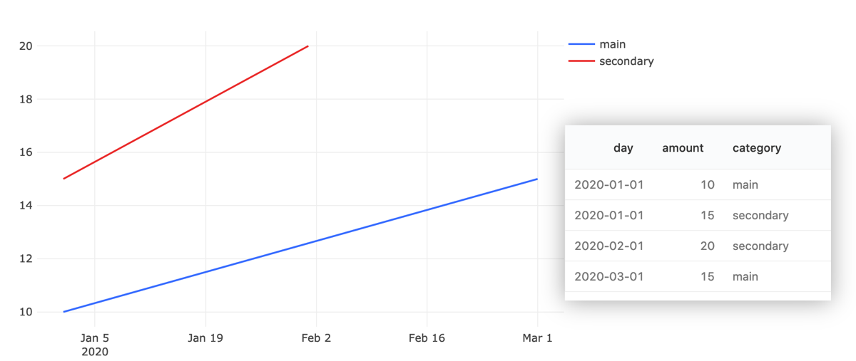
The **Series** tab is powerful. It lets you change your data aliases, z-index behavior, assign traces between the left- and right- Y axes. It also lets you combine different trace forms on one chart like in the chart below.
**Colors** gives you a color picker for changing the appearance of the traces on your charts.
**Data Labels** controls what appears when you hover your mouse over a chart.
visualizations settings
### 2. Grouping
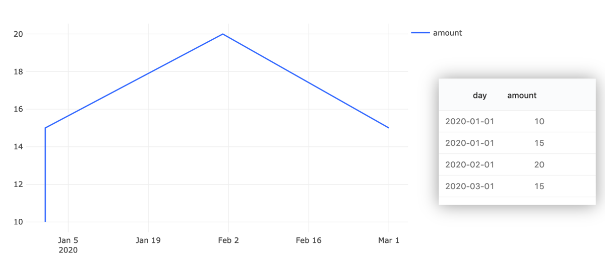
The **Group By** setting can generate multiple traces against the same X and Y axes. It does this by grouping records into distinct traces instead of drawing one line. Almost every time you see multiple colors of line or bar in a chart, it’s because the query results included a grouping column.
As shown in the below example, the grouping column is used to sort `(x,y)` pairs together.
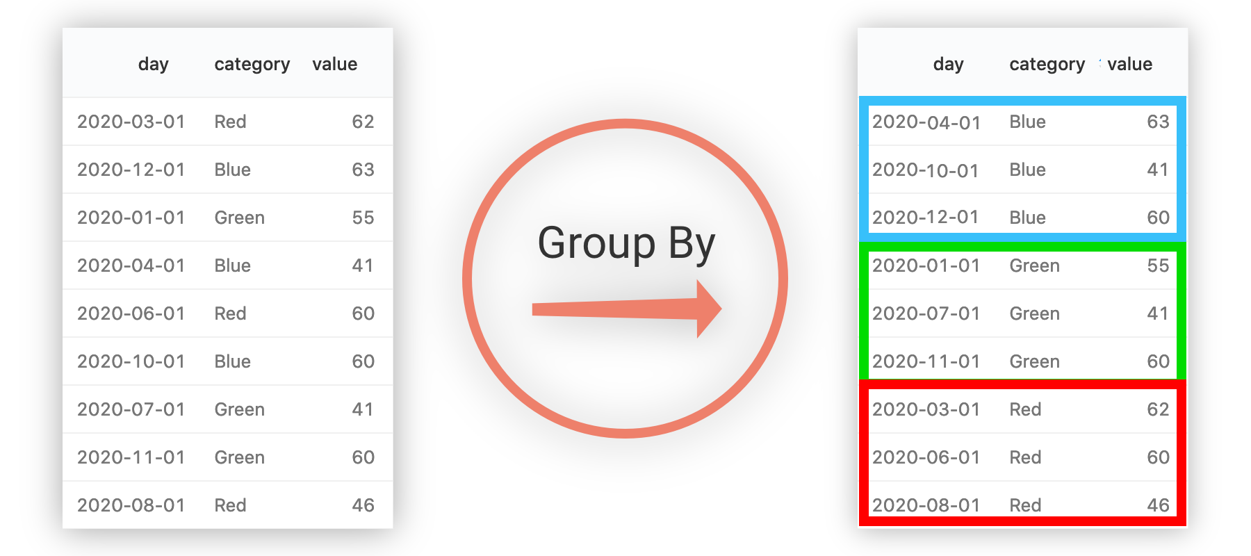
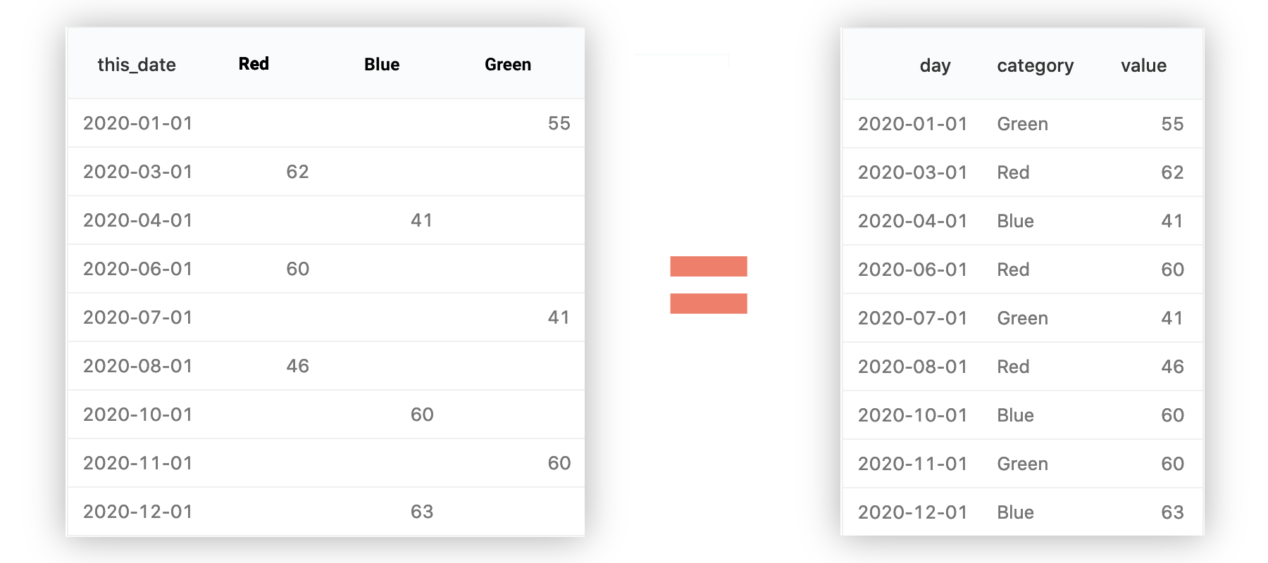
Use of **Group By** is often easier than writing queries which return multiple Y columns for an X value. The following two data sets are identical.
{% hint style="info" %}
Use the **Group By** column for melted data sets. Use multiple Y-columns for pivoted data sets
{% endhint %}
### 3. Stacking
The application can “stack” your Y axis values on top of one another. The name name is borrowed from [Stacked Bar Charts](https://en.wikipedia.org/wiki/Bar_chart#Grouped_and_stacked), but it can be useful with area charts as well. The below image shows the same data, unstacked on the left and stacked on the right.
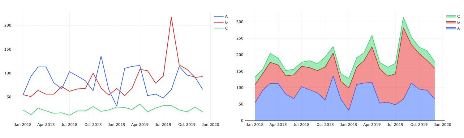
Notice how each Y axis value is displayed as the sum of itself and the Y values “beneath” it.
{% hint style="info" %}
Stacking and Grouping are related. You won’t stack data unless you have also grouped it.
{% endhint %}
You can use the **Series** tab of the Visualization Editor to control the order in which traces are stacked. You can also control it by adding an `ORDER BY` statement to your query. The stack follows the order in which your group names first appear in your query result. Stacking is only available for Line, Bar, and Area charts.
### 4. Error Bars
For certain chart forms, the application can draw error bars around your data points using values from your query result. A few things are always true of error bars:
1. Error bars are always symmetrical. The distance above and below a given `(x,y)` pair is always the same.
2. Errors are the same color as their target trace
3. Errors are shown for all traces or no traces. They cannot be configured to appear on some traces and not others.
4. The values in your errors column will be charted on the same axis as their associated trace. This means your error values must be absolute. You cannot, for example, have errors expressed in percentages for Y values expressed in hundreds.
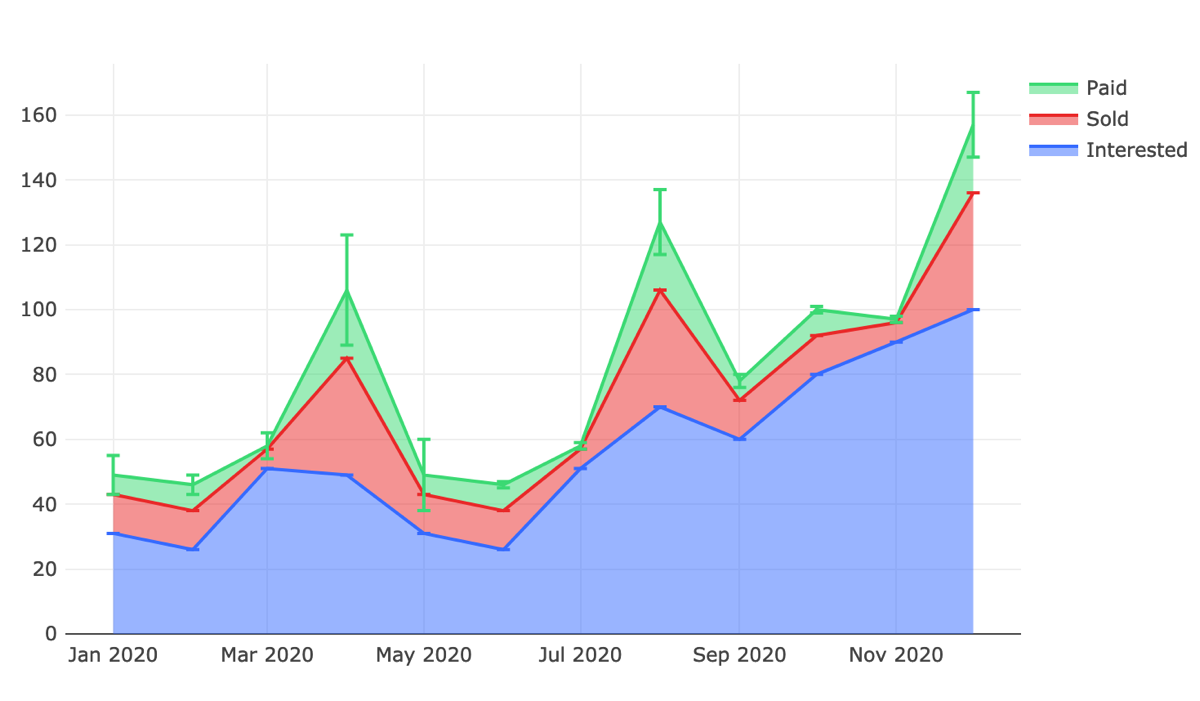
Also keep in mind that errors are not aggregated when you stack records. An error bar will be shown for each trace. You can work around this by only providing non-zero error values for those records where the error should be displayed prominently. See in the above example that a flat error bar is shown at every trace point. But only the `Paid` trace error bars have any length.
### 5. Using Chart Forms
Each chart form is useful for certain kinds of presentation. You can mix and match multiple forms on the same chart as needed.
* **Line** charts are almost exclusively used to present change in one or more metrics over *time*.
* **Bar** charts can be used to present change in metrics over time or to show proportionality, like a pie chart. Bar charts can be combined with [Stacking](https://redash.io/help/user-guide/visualizations/chart-visualizations#Stacking) with great effect. Horizontal bar charts are also supported.
* **Area** charts are often used to show sales funnel changes through time. They are frequently combined with [Stacking](https://redash.io/help/user-guide/visualizations/chart-visualizations#Stacking) to grant a broader picture.
* **Pie** charts are designed to show proportionality between metrics. They are *not* meant for conveying time series data.
* **Scatter** charts excel at showing many groups of data points. Under the covers, Scatter plots are just like line plots, but without the connecting lines. A scatter graph is more precise but less useful for time series data.
{% hint style="info" %}
Scatter plots are necessary for visualizations where some groups appear just once. The line chart does not display singleton values because it can only show data where two or more points are present. One option is to force singletons into scatter form on the **Series** tab of the Visualization Editor while keeping other traces in line form.
{% endhint %}
* **Bubble** charts are scatter graphs where the size of each point marker reflects a relevant metric.
* **Heatmap** visualizations blend features of bar charts, stacking, and bubble charts. There are several built-in color schemes to pick from. Heatmaps cannot be grouped since the entire chart is technically one trace.
* **Box** plots can automatically show the distribution of data points across grouped categories. Horizontal box plots are also supported.
### 6. Common Mistakes
* Multiple Records per X-axis value
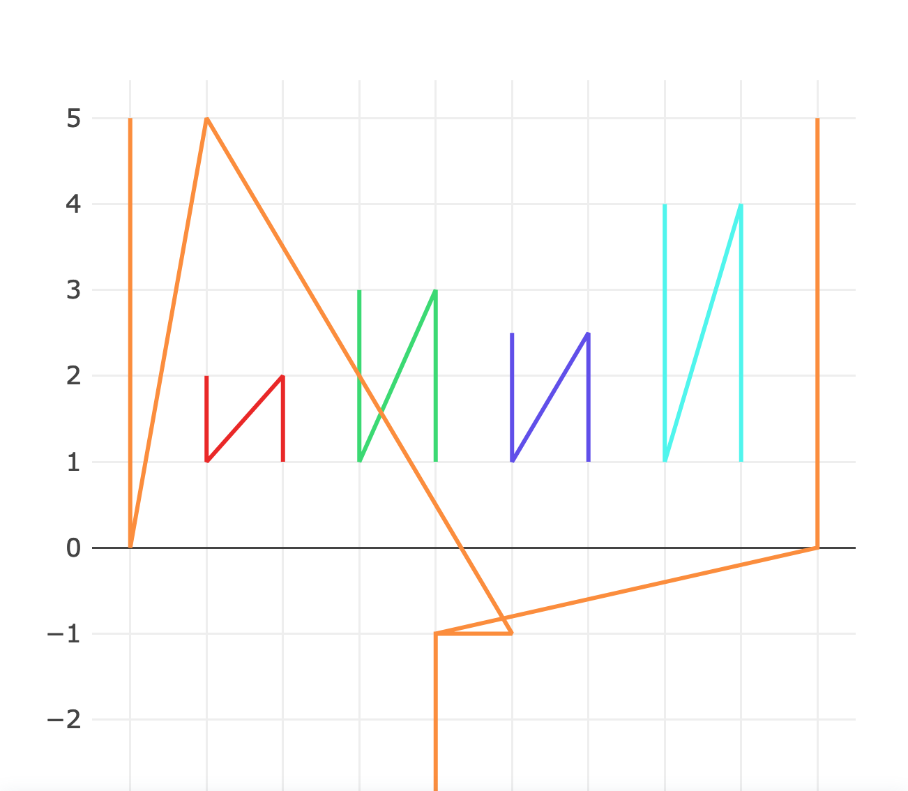
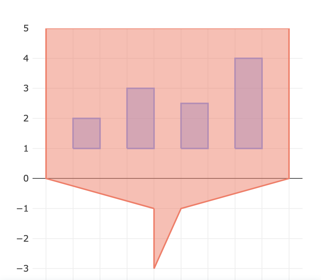
The application can make some crazy shapes if your query returns two or more rows with the same **X axis** value. This often happens in SQL if you unintentionally `JOIN` a table with a one-to-many relationship.
In this example a vertical line is drawn because there are two records for 1 January. You can resolve this by filtering out the doubled entries on the **X axis**. Or revise the query to include [grouping](https://redash.io/help/user-guide/visualizations/chart-visualizations#Grouping) field, as shown below.
###
* Unordered X-axis records
The application is smart enough to figure out most common **X axis** scales: timestamps, linear, and logarithms. But if it can’t parse your X column into an ordered series, it falls back to treating each X value as a “category”. This can have mixed results:
If you see shapes you don’t expect you can check whether your X axis has been sorted on the **X Axis** tab of the Visualization Editor. Just toggle the *Sort Values* option. If *Sort Values* is disabled then the application retains the ordering of the source query.
These two charts come from the same base data. The only difference is whether or not the application sorted the X axis values.
###
---
# Agent Instructions
This documentation is published with GitBook. GitBook is the documentation platform designed so that both humans and AI agents can read, navigate, and reason over technical content effectively. Learn more at gitbook.com.
## Querying This Documentation
If you need additional information that is not directly available in this page, you can query the documentation dynamically by asking a question.
Perform an HTTP GET request on the current page URL with the `ask` query parameter, and the optional `goal` query parameter:
```
GET https://docs.inverse.watch/user-guide/visualizations/chart-visualizations.md?ask=&goal=
```
`ask` is the immediate question: it should be specific, self-contained, and written in natural language.
`goal` is optional and describes the broader end goal you are ultimately trying to accomplish on behalf of the user. GitBook uses it to tailor the answer towards what is most useful for that goal.
The response will contain a direct answer to the question and relevant excerpts and sources from the documentation.
Use this mechanism when the answer is not explicitly present in the current page, you need clarification or additional context, or you want to retrieve related documentation sections.